Pantone Color of the year 2022
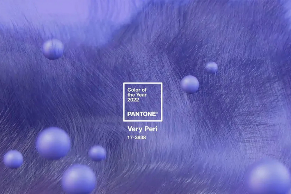
“As we move into a world of unprecedented change, the selection of PANTONE 17–3938 Very Peri brings a novel perspective and vision of the trusted and beloved blue color family, encompassing the qualities of the blues, yet at the same time with its violet red undertone, PANTONE 17–3938 Very Peri displays a spritely, joyous attitude and dynamic presence that encourages creativity and imaginative expressions.” ~ Leatrice Eiseman, Executive Director of the Pantone Color Institute.
After this -less or more continuing- long period of isolation, we find ourselves with our perspectives and thoughts shifted. Any plans for the future are already altered, while the borders of analog and digital worlds collapsing to one. Truth is most of these changes came with a violent way as pandemic forced a global physical and mental reset of everything already set.
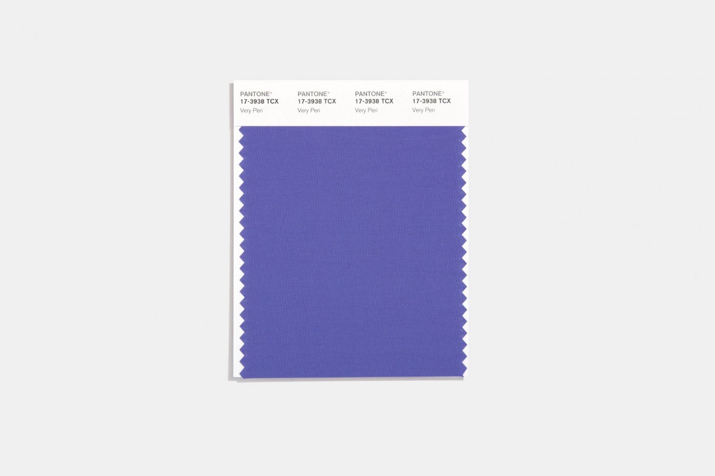
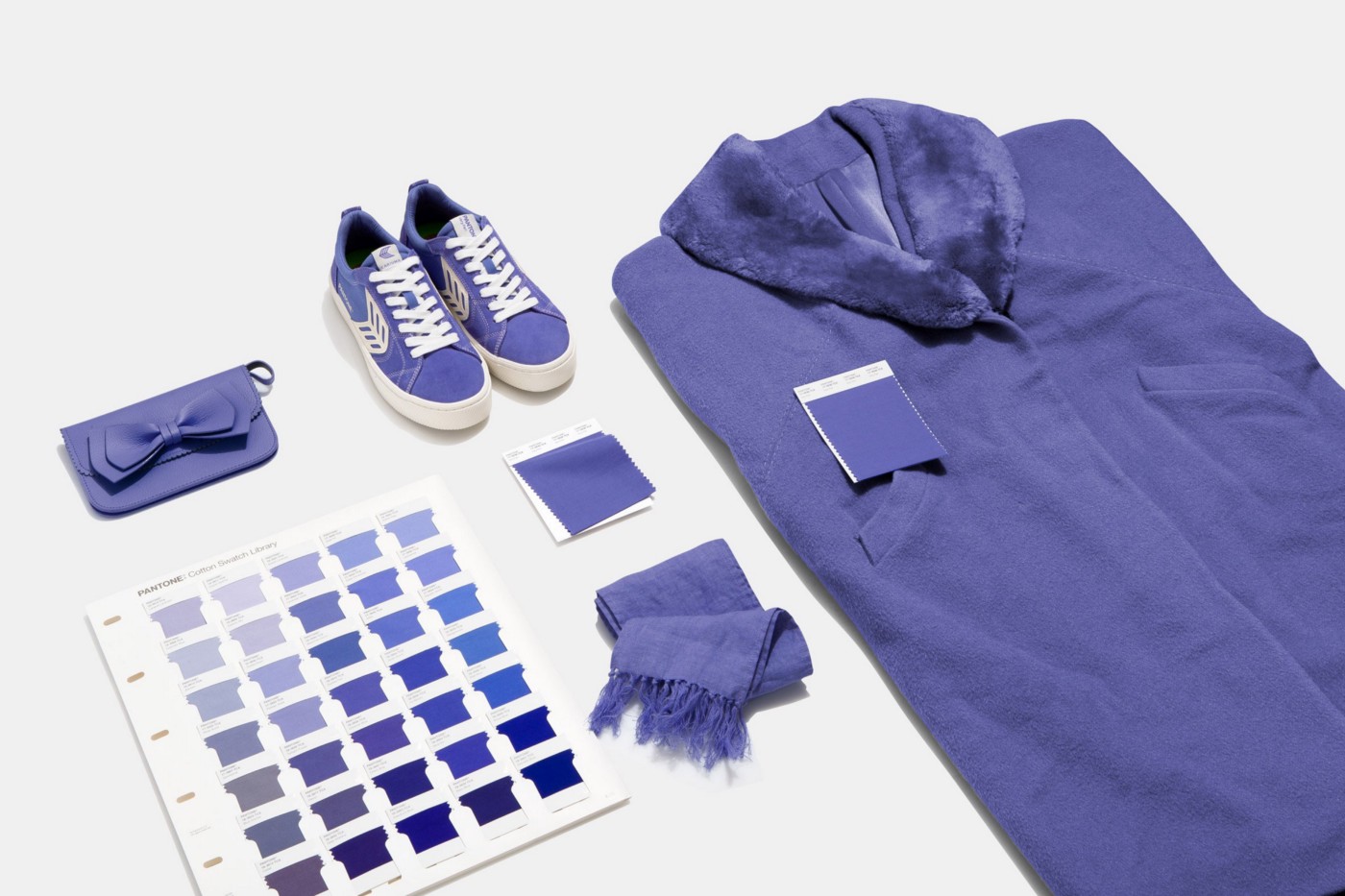
Honoring the need for creativity more than ever, for the first time this year, the brand decided to create a new shade that wasn’t already in its existing catalogue of colours for its colour of the year. To do so, the company blended blue tones with a violet-red.
The resulting Very Peri is similar to colours commonly found in nature, such as lavender flowers and birds with light purple plumage.
According to Pantone, Very Peri is indicative of the current physical and digital landscape. The American company cites the rise in the metaverse and the impact of coronavirus lockdowns as key elements that have informed the colour choice.
“Pantone 17–3938 Very Peri is a symbol of the global zeitgeist of the moment and the transition we are going through,” the brand explained.
“As we emerge from an intense period of isolation, our notions and standards are changing, and our physical and digital lives have merged in new ways.”
So let’s embrace life! Let’s stay safe and strong! For the best to come.